
Python数据抓取与可视化实战网易云课堂人工智能与大数据板块课程实战
美团点评 商业分析师
12 人赞同了该文章

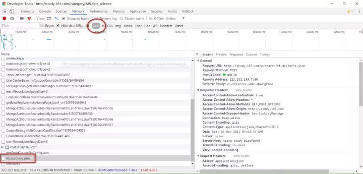
本篇内容数据抓取对象为网易云课堂人工智能与大数据板块课程信息,使用的工具是urllib+postman,因为直接构建的POST抓取的josn数据包,所以数据抓取的代码非常简单,没有繁杂的xpath或者css表达式。可视化部分使用matplotlib,感谢刘顺祥大神的matplotlib教程系列,让我没怎么费力气就直接复用了大量代码!
https://mp.weixin.qq.com/s/E_r5ZsV9HOyuhnFwqsRXeA
以下是数据抓取部分代码:
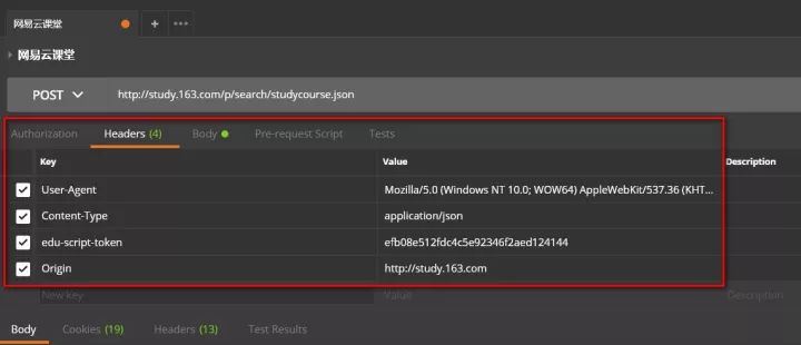
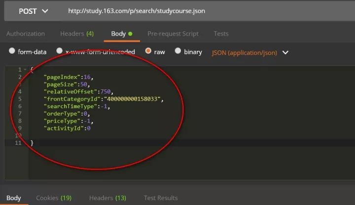
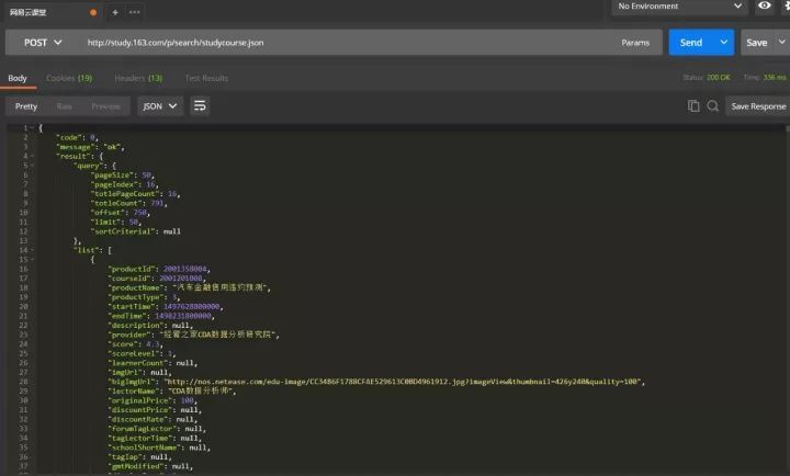
import json,timefrom urllib.request import urlopen,Requestheaders = { 'content-type':'application/json', ###这里要特别注意,edu-script-token参数是一个变动从参数, ###每请求一次都会变动,所以这里的代码需要你使用自己在网易云课堂后台找到 ###请求的edu-script-token参数,否则直接运行此代码是无法出结果的 'edu-script-token':'efb08e512fdc4c5e92346f2aed124144', 'Host':'study.163.com', 'Origin':'http://study.163.com', 'User-Agent':'Mozilla/5.0 (Windows NT 10.0; WOW64) AppleWebKit/537.36 (KHTML, like Gecko) Chrome/61.0.3163.79 Safari/537.36' }Payloads={ "pageIndex":1, "pageSize":50, "relativeOffset":0, "frontCategoryId":"400000000158033", "searchTimeType":-1, "orderType":0, "priceType":-1, "activityId":0 }url='http://study.163.com/p/search/studycourse.json'def GetCourses(url,header=headers,Payload=Payloads): fullinfo= for i in range(1,17): Payload['pageIndex']=i Payload['relativeOffset']=50*i-50 content=Request(url,data=json.dumps(Payload).encode(encoding='utf-8'),headers=header) response=json.loads(urlopen(content).read.decode('UTF-8')) fullinfo=fullinfo+response['result']['list'] print("第页已抓取完毕".format(i)) time.sleep(1) print("all page is OK!!!") return fullinfo#运行程序:mydata=GetCourses(url)#转换为数据框myresult=pd.DataFrame(mydata)#查看变量信息:myresult.infomyresult=myresult.astype({'courseId':'str'})#删除数据缺失列nouse=['bigImgUrl','activityIds','gmtModified','published','schoolShortName','tagIap','tagLectorTime','courseCardProps','displayType','endTime','imgUrl','productId','startTime']myresult=myresult.drop(nouse, axis=1)myresult.head(10) #预览数据myresult=myresult.set_index('courseId')myresult.to_csv('D:/Python/Data/yunketang_ai_bigdata.csv')
以下是使用Chome+postman进行POST请求构建的过程:


以上是本次爬取数据表,按照这些字段属性,之前曾经做过一期网易云课堂Excel模块课程抓取与可视化的推送。因为云课堂的课程信息字段基本一致,本次分析仍然 按照那个思路进行。
结合我个人的需求以及云课堂的课程评价体系,我将本次分析的目标及思路梳理如下:
分析
作者贡献数
课程内容分析
高频技能需求
课程价格分析
课程价格分析
课程知名度分析
用户数分析
课程口碑分析
评分分析
根据以上几个模块,我们开始今天的可视化分析之旅!
1、分析:
云课堂人工智能与大数据模块一共有791门有效课程,课程字段中提供了机构信息和教师信息,倘若机构信息与教师信息一致,那么基本可以认为课程是个人名义发布的,否则则是以机构名义发布的。(不一定客观,本次以代码练习为主)。
myresult.columnssum(myresult.lectorName==myresult.provider)/len(myresult)0.34639696586599239import matplotlib.pyplot as plt%matplotlib inlineplt.style.use('classic') labels = ['个人','机构'] colors=['#2D6D66','#008BBC'] plt.figure(figsize=(8,6),facecolor='#ebebeb') plt.rcParams['font.sans-serif'] = ['Microsoft YaHei'] plt.rcParams['axes.unicode_minus'] = Falseplt.axes(aspect='equal',facecolor='#ebebeb') ax =plt.gcaax.spines['left'].set_visible(False)ax.spines['right'].set_visible(False) ax.spines['top'].set_visible(False) ax.spines['bottom'].set_visible(False) plt.xlim(0,4) plt.ylim(0,4)# 绘制饼图plt.pie(percent, labels=labels, colors=colors, autopct='%.1f%%', pctdistance=0.8, labeldistance = 1.15, startangle = 90, radius = 1.5, counterclock = False, wedgeprops = {'linewidth': 0.5,'edgecolor':'white'}, textprops = {'fontsize':14,'color':'k'}, center = (1.8,1.8), frame = 1 ) plt.xticks plt.yticksplt.title('云课堂人工智能与大数据模块性质分布',fontdict={'fontsize':16},loc='left')plt.show
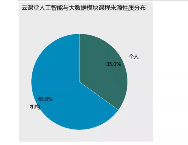
从饼图可以很明显的看到,个人发布的课程占据整个课程模块课程总量的约35%,而机构则占了大多数,搞到65%,还记得我们上次分析Excel板块课程的时候得到的结论吗,Excel板块的课程中个人发布的课程量高达63%,而人工智能大数据板块则是机构的天下。个人觉得人工智能与大数据行业是一个高门槛、高技术行业,所需要的条件和依赖的资源都不是个人可以负担的,所以这个行业的课程基本都是机构或者团队化运作。
作者贡献数:
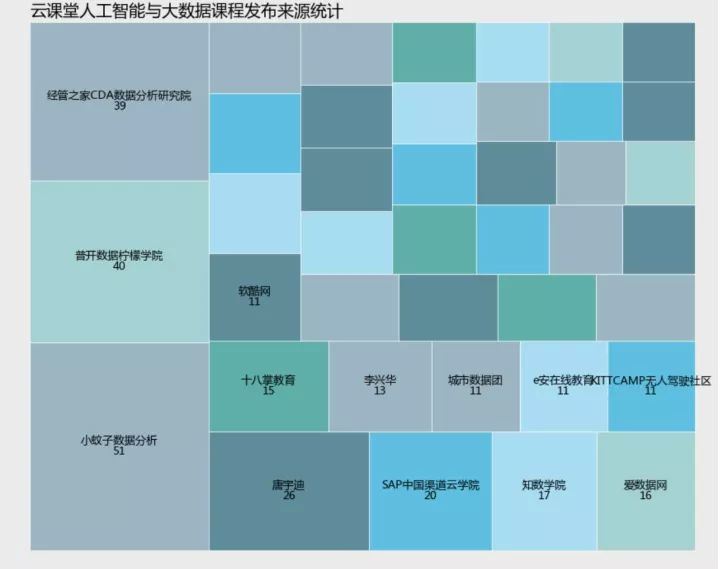
import squarifyimport randomcount=myresult['provider'].value_countscount=count.sort_values(ascending=False)以下通过树状图来呈现那些发布课程频率(数量)比较处于前列的机构或者个人。plt.style.use('classic') plt.rcParams['font.sans-serif'] = 'Microsoft YaHei'plt.rcParams['axes.unicode_minus'] = Falseplt.figure(figsize=(13,10),facecolor='#ebebeb') colors = ['#6794a7','#014d64','#76c0c1','#01a2d9','#7ad2f6','#00887d']plot = squarify.plot(sizes =count[count 5].values , label = list(count[count 10].index)+['']*27, color = random.choices(colors,k=len(count[count 5])), alpha = 0.6, value = list(count[count 10].values)+['']*27, edgecolor = 'white', linewidth =1 ) plot.set_title('云课堂人工智能与大数据课程发布来源统计',fontdict = {'fontsize':18},loc='left') plt.axis('off') plt.tick_params(top = 'off', right = 'off') plt.show
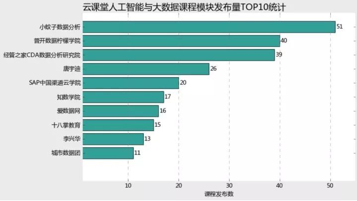
我筛选了发布课程的前十名,并用条形图来进行呈现。
plt.style.use('classic')plt.rcParams['font.sans-serif'] =['Microsoft YaHei']plt.rcParams['axes.unicode_minus'] = Falseplt.figure(figsize=(10,6),facecolor='#ebebeb')plt.barh(range(9,-1,-1),count.values[:10], align = 'center',color=random.choices(colors), alpha = 0.8)plt.xlim(1,55)plt.yticks(range(9,-1,-1),count.index[:10])plt.xlabel('课程发布数')plt.title('云课堂人工智能与大数据课程模块发布量TOP10统计',fontdict = {'fontsize':18},loc='left')ax =plt.gcaax.spines['left'].set_visible(False)ax.spines['right'].set_visible(False) ax.spines['top'].set_visible(False) ax.spines['bottom'].set_visible(False) ax.grid(axis= 'x',which= 'major',linestyle='dashed',color='grey') for x,y in zip(range(9,-1,-1),count.values[:10]): plt.text(y+0.2,x,'%s' %y,va='center')plt.show
通过以上树状图和条形图的数据呈现,我们可以很清晰的看到,小蚊子团队居然在人工智能和大数据板块一共发布了51门课程,要知道这个模块一共只有791门有效课程,这可是足足占了总课程量的51/791=6.5%啊我天,着实是高产至极,记得最初学习数据分析的时候,就层看过张闻霖老师的谁说菜鸟不会数据分析系列,为老师的高产点赞!!!
这个条形图可以看出发布课程数在10门以上的top10作者,基本呈现三级梯队分布,各梯队间距10门左右,小蚊子数据分析基本占据第一梯队,出于第二梯队的是普开数据柠檬学院和经管之家CDA数据分析研究院,分别发布了40、39门课程。而第三梯队课程发布数基本在30门以下,除了唐宇迪老师发布了26门,SAP中国渠道云学院发布了20门之外,其他均不足20门。鉴于人工智能与大数据行业的高门槛性,依然能以这么高频率发布课程,当然是只有团队运作才能支撑的起如此的资源和高强度课程量,这样印证了我们上文说过的,机构作者与个人作者的分布比例。
count2=myresult['provider'].value_countsplt.style.use('classic') plt.rcParams['font.sans-serif'] = 'Microsoft YaHei'plt.rcParams['axes.unicode_minus'] = Falsefig = plt.figure(figsize=(10,6),facecolor='#ebebeb')plt.plot(range(0,219), count2.cumsum, linestyle = '-', linewidth = 2, color = '#2D6D66', marker = 'o', markersize = 4, markeredgecolor='white', markerfacecolor='#C10534' ) plt.title('人工智能与大数据课程累计发布频率分布') plt.xlabel('作者累计数(按照发布课程数量排序)') plt.ylabel('课程发布频数') ax =plt.gcaax.spines['left'].set_visible(False)ax.spines['right'].set_visible(False) ax.spines['top'].set_visible(False) ax.spines['bottom'].set_visible(False) ax.grid(axis= 'x',which= 'major',linestyle='dashed',color='grey') plt.xlim(-1,225)plt.yticks(range(0,800,100),range(0,800,100))plt.tick_params(top = 'off',right='off') plt.show
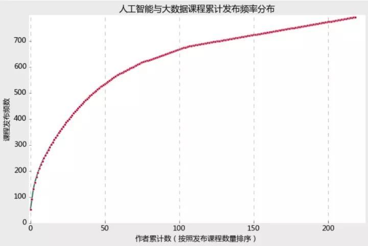
以上我将所有课程作者按照发布课程频数做了累计分布呈现,可以看到前50个作者的课程贡献数已经累计达到了500门以上,而之后分布曲线已经大幅走缓,最后坡度已经接近直线,说明该板块的课程主要集中在那些少数机构手中,特别是前50名作者发布了超过500门课程,也即25%的作者掌握着70%以上的课程资源,可见该模块课程的垄断程度。
2、课程内容分析:
import jiebafrom wordcloud import WordCloud, STOPWORDS, ImageColorGenerator import matplotlib.pyplot as pltimport numpy as np
课程标题分词高频词汇统计
word_list = [" ".join(jieba.cut(sentence)) for sentence in myresult['productName']]new_text = ' '.join(word_list) wc= WordCloud( background_color="white", max_words=2000, stopwords=STOPWORDS.add("said"), max_font_size=80, font_path = 'msyh.ttf', random_state=42 ) wordcloud =wc.generate(new_text)fig = plt.figure(figsize=(10,8),facecolor='#ebebeb')plt.imshow(wordcloud,interpolation="bilinear")plt.axis("off")plt.show

课程描述高频词汇统计
word_list = [" ".join(jieba.cut(sentence)) for sentence in myresult['description'] if sentence!=None]new_text = ' '.join(word_list) new_text=new_text.replace("\n","")wc= WordCloud( background_color="white", max_words=2000, stopwords=STOPWORDS.add("said"), max_font_size=80, font_path = 'msyh.ttf', random_state=42 ) wordcloud =wc.generate(new_text)fig = plt.figure(figsize=(10,8),facecolor='#ebebeb')plt.imshow(wordcloud,interpolation="bilinear")plt.title('人工智能与大数据课程描述高频词统计')plt.axis("off")plt.show

从课程名称以及课程描述的分词统计来看,该模块的标题还是侧重与基础、入门、实战、应用等较低层次的需要需求,而对于机器学习、深度学习、算法、构架等较为深入的层面词频分布较少,这也从侧面可以看出,网易云课堂的大数据与人工智能模块课程更侧重数据科学的入门、通识级别学习资源。(由于手头没有合适的关于数据科学领域的停止词,所以没有使用停止词,函数中那个停止词是英文的,只能清楚一些特殊符号和标点,所以课程描述的分词结果并不理想)。
3、课程价格分析
本来对于课程来讲,价格分析是极具价值的课程信息,但是遗憾的是,折扣价缺失过于严重,这里我用原价进行分析(尽管原始价格可能不能反映课程质量)。
price_data1=myresult.loc[myresult['originalPrice']!=0,['lectorName','originalPrice','productName','learnerCount','score']].sort_values(by='originalPrice',ascending=False)len(price_data1)/len(myresult);len(price_data1)0.6662452591656132527
从原始价格来看,一共有527门付费课程,总体付费课程占比66.7%。但是对于在线课程而言,单纯高价而没有用户(或者用户极少),或者完全为了给其他平台引流而,都不能真正体现出课程的价值。
price_data1.iloc[:10]
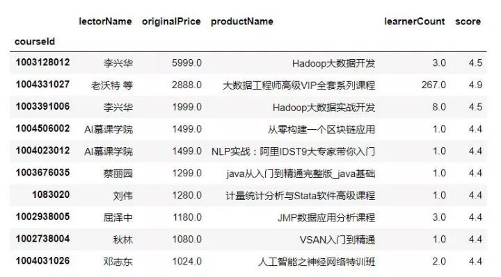
价格前十位的用户数可以看出,除了第二个课程外,这些价格虚高的课程很少有人问津,或者换句话说,网易云课堂本就不是一个人工智能与大数据深度课程资源集聚地,多数课程以入门或者通识为主,而学习者的对于高价课程的付费意愿也不高,这到底是因为云课堂的平台性质决定了内容深度,还是用户群体的需求性质与付费意愿决定了课程内容与深度,这一点很难讲。
我剔除掉10元以下、1000元以上的课程,希望这样可以使得结果相对客观一些!
course1000=price_data1.loc[(price_data1.originalPrice =10) &(price_data1.originalPrice =1000),]len(price_data1.loc[price_data1.originalPrice 10,])len(price_data1.loc[price_data1.originalPrice 1000,])len(course1000)62 10 455course1000new=course1000.groupby('lectorName')['originalPrice'].meancourse1000new=course1000new.sort_values(ascending=False)[:10]plt.style.use('classic') plt.rcParams['font.sans-serif'] = 'Microsoft YaHei'plt.rcParams['axes.unicode_minus'] = Falsefig = plt.figure(figsize=(10,8),facecolor='#ebebeb')plt.bar(range(10),course1000new.values,align = 'center',color=random.choices(colors), alpha = 0.8)ax =plt.gcaax.spines['left'].set_visible(False)ax.spines['right'].set_visible(False) ax.spines['top'].set_visible(False) ax.spines['bottom'].set_visible(False) ax.grid(axis= 'y',which= 'major',linestyle='dashed',color='grey') plt.ylabel('课程平均价格')plt.title('人工智能与大数据课程平均价格分析',fontdict = {'fontsize':18},loc='left')plt.xticks(range(10),course1000new.index)plt.ylim(0,1000)for x,y in enumerate(course1000new.values): plt.text(x,y+10,'%s' % y,ha='center')plt.show
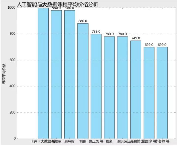
从课程平均价格来看,卡夫卡大数据、张耀军、易丹辉价格占据前三甲,分别为999、980、其他课程作者价格均在900以下。
4、课程用户分析:
用于用户数与课程是否收费有极大的关系,所以付费课程与课程放在一起分析用户数是不合理的。
learn_data=myresult.loc[:,['provider','originalPrice','learnerCount','score','productName']]princeno=learn_data.loc[learn_data.originalPrice!=0,['productName','provider','originalPrice','learnerCount']].sort_values \(by='learnerCount',ascending=False)import matplotlib.pyplot as pltimport random%matplotlib inlinecolors = ['#6794a7','#014d64','#76c0c1','#01a2d9','#7ad2f6','#00887d']plt.style.use('classic')plt.rcParams['font.sans-serif'] =['Microsoft YaHei']plt.rcParams['axes.unicode_minus'] = Falseplt.figure(figsize=(10,6),facecolor='#ebebeb')plt.barh(range(9,-1,-1),princeno.learnerCount[:10], align = 'center',color=random.choices(colors), alpha = 0.8)plt.xlim(1,2500)plt.yticks(range(9,-1,-1),princeno.productName[:10])plt.tick_params(top = 'off',right='off',bottom='off',left='off') plt.xlabel('学员数量')plt.title('云课堂人工智能与大数据课程模块付费课程学院人数TOP10统计',fontdict = {'fontsize':18},loc='left')ax =plt.gcaax.spines['left'].set_visible(False)ax.spines['right'].set_visible(False) ax.spines['top'].set_visible(False) ax.spines['bottom'].set_visible(False) ax.grid(axis= 'x',which= 'major',linestyle='dashed',color='grey') for x,y in zip(range(9,-1,-1),princeno.learnerCount[:10]): plt.text(y+2,x,'%s' %y,va='center')plt.show
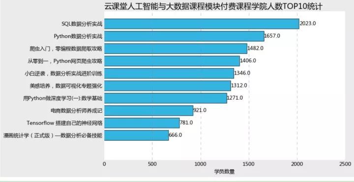
付费课程中,最高量级的学院数量课程为SQL数据分析实践,学员数有2000+,值得注意的是,top10课程中竟然有四门涉及Python或者爬虫实战课程,可见大家对于爬虫需求量是多么旺盛。
princeyes=learn_data.loc[learn_data.originalPrice==0,['productName','provider','originalPrice','learnerCount']].sort_values \(by='learnerCount',ascending=False)plt.style.use('classic')plt.rcParams['font.sans-serif'] =['Microsoft YaHei']plt.rcParams['axes.unicode_minus'] = Falseplt.figure(figsize=(10,6),facecolor='#ebebeb')plt.barh(range(9,-1,-1),princeyes.learnerCount[:10], align = 'center',color=random.choices(colors), alpha = 0.8)plt.xlim(1,140000)plt.yticks(range(9,-1,-1),princeyes.productName[:10])plt.tick_params(top = 'off',right='off',bottom='off',left='off') plt.xlabel('学员数量')plt.title('云课堂人工智能与大数据课程模块课程学院人数TOP10统计',fontdict = {'fontsize':18},loc='left')ax =plt.gcaax.spines['left'].set_visible(False)ax.spines['right'].set_visible(False) ax.spines['top'].set_visible(False) ax.spines['bottom'].set_visible(False) ax.grid(axis= 'x',which= 'major',linestyle='dashed',color='grey') for x,y in zip(range(9,-1,-1),princeyes.learnerCount[:10]): plt.text(y+20,x,'%s' %y,va='center')plt.show
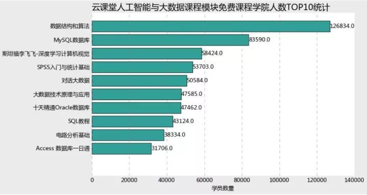
而反观课程模块,最具人气的是数据结构与算法,竟然达到了126000+的学院数量,第二名是MySQL数据库,用户量达到了83590,之后的8门用户量均在60000以下。有趣的是,课程的用户量top10中,竟然有4门数据库相关,可见数据库技能在数据科学中地位与重要性以及普及程度。
但是付费课程与课程的用户量级差异极大,基本都在10倍数量差以上,由此可见付绝大多数用户对于价格还是敏感的。
5、用户评分分析:
因为评分是5分制的,而且只能精确到一位小数,所以这里我使用单个作者所有课程的累计评分和来进行简要分析(因为累计评分跟课程数量有关,计算总评分量可能不够客观,这里仅用作综合人气的替代指标,因为平均评分会出现大量相同的评分)。
scoreno=learn_data.loc[learn_data.originalPrice==0,].groupby('provider')['score'].sum.sort_values(ascending=False)plt.style.use('classic')plt.rcParams['font.sans-serif'] =['Microsoft YaHei']plt.rcParams['axes.unicode_minus'] = Falseplt.figure(figsize=(10,6),facecolor='#ebebeb')plt.barh(range(9,-1,-1),scoreno.values[:10], align = 'center',color=random.choices(colors), alpha = 0.8)plt.xlim(1,250)plt.yticks(range(9,-1,-1),scoreno.index[:10])plt.tick_params(top = 'off',right='off',bottom='off',left='off') plt.xlabel('累计评分')plt.title('云课堂人工智能与大数据课程模块课程累计评分TOP10统计',fontdict = {'fontsize':18},loc='left')ax =plt.gcaax.spines['left'].set_visible(False)ax.spines['right'].set_visible(False) ax.spines['top'].set_visible(False) ax.spines['bottom'].set_visible(False) ax.grid(axis= 'x',which= 'major',linestyle='dashed',color='grey') for x,y in zip(range(9,-1,-1),scoreno.values[:10]): plt.text(y+0.2,x,'%s' %y,va='center')plt.showscoreyes=learn_data.loc[learn_data.originalPrice!=0,].groupby('provider')['score'].sum.sort_values(ascending=False)plt.style.use('classic')plt.rcParams['font.sans-serif'] =['Microsoft YaHei']plt.rcParams['axes.unicode_minus'] = Falseplt.figure(figsize=(10,6),facecolor='#ebebeb')plt.barh(range(9,-1,-1),scoreyes.values[:10], align = 'center',color=random.choices(colors), alpha = 0.8)plt.xlim(1,250)plt.yticks(range(9,-1,-1),scoreyes.index[:10])plt.tick_params(top = 'off',right='off',bottom='off',left='off') plt.xlabel('累计评分')plt.title('云课堂人工智能与大数据课程模块免付费程累计评分TOP10统计',fontdict = {'fontsize':18},loc='left')ax =plt.gcaax.spines['left'].set_visible(False)ax.spines['right'].set_visible(False) ax.spines['top'].set_visible(False) ax.spines['bottom'].set_visible(False) ax.grid(axis= 'x',which= 'major',linestyle='dashed',color='grey')for x,y in zip(range(9,-1,-1),scoreyes.values[:10]): plt.text(y+0.2,x,'%s' %y,va='center')plt.show
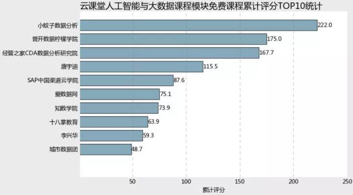
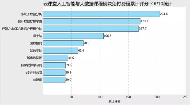
从与付费课程发布作者的累计评分综总数来看,小蚊子数据分析都夺得头筹,可见小蚊子老师是在和付费课程上都贡献了绝对多数的课程量,两线发力,因而坐拥庞大的用户群体。
有意思的是,在top10课程机构和付费课程机构累计评分top10榜单中,竟然有七席课程一直保持在榜单内,前四席课程的排序并未易主,说明这些大机构团队基本都是是双线发力,在开发付费课程的同时,也兼顾课程的蓄力,进而交叉引流,开拓用户群体。
coursename=list(set(scoreno.index[:10,]).intersection(set(scoreyes.index[:10,])))princeno=learn_data.loc[(learn_data['provider'].isin(coursename)) & (learn_data['originalPrice']==0),'provider'].value_countsprinceyes=learn_data.loc[(learn_data['provider'].isin(coursename)) & (learn_data['originalPrice']!=0),'provider'].value_countsprinceresult = pd.concat([princeno,princeyes], axis=1)princeresult=princeresult.rename(index=str, columns={"provider":"priceno", "provider":"priceyes"})plt.style.use('classic')plt.rcParams['font.sans-serif'] = 'Microsoft YaHei' plt.rcParams['axes.unicode_minus'] = Falsevalues = princeresult.iloc[:,0].valuesvalues2 =princeresult.iloc[:,1].valuesfeature = princeresult.indexangles=np.linspace(0, 2*np.pi,len(values), endpoint=False)values=np.concatenate((values,[values[0]]))values2=np.concatenate((values2,[values2[0]]))angles=np.concatenate((angles,[angles[0]]))fig=plt.figure(figsize=(10,8),facecolor='#ebebeb')ax = fig.add_subplot(111, polar=True)ax.plot(angles, values, 'o-', linewidth=2, label = '')ax.fill(angles, values, alpha=0.25)ax.plot(angles, values2, 'o-', linewidth=2, label = '付费')ax.fill(angles, values2, alpha=0.25)ax.set_thetagrids(angles * 180/np.pi, feature)ax.set_ylim(0,50)plt.title('高价值课程发布者与付费课程发布量',fontdict = {'fontsize':18},loc='left')ax.grid(True)plt.legend(loc = 'best')